Drawing Letters
Author: Kipp Jones | 10.02.2017
Given our field of design practice, letters and pieces of type are of perpetual interest.
In-depth branding work often requires bespoke letter sets, typographical inventions, and hand-drawn logotypes, to achieve truly relevant design solutions.
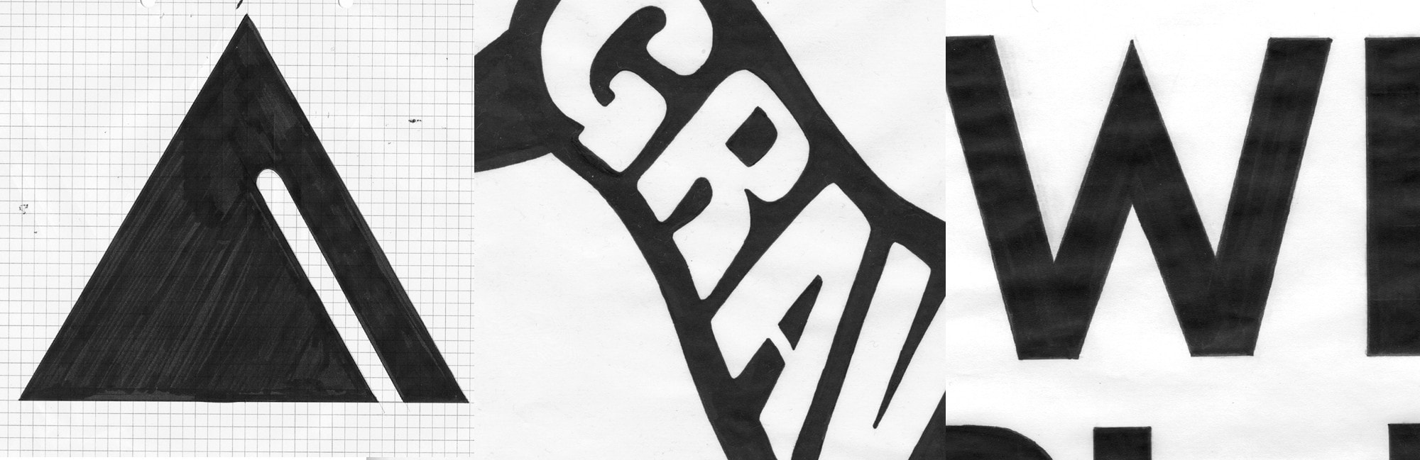
During one of our first branding projects, for We Are Birmingham we spent a lot of time exploring the old industrial parts of Birmingham, photographing pieces of type, signage and architecture. We found that by borrowing angles, cuts and forms from these observations we were able to draw new sets of letters, that referenced the city’s heritage directly and became the key to the success of the project.
This process soon became a staple part of our design approach and helped us to thoroughly research projects and look at type in a much more analytical manner. We found that by looking closely at the nuances of different typefaces our graphic design in general was elevated and became more relevant on a per project basis.
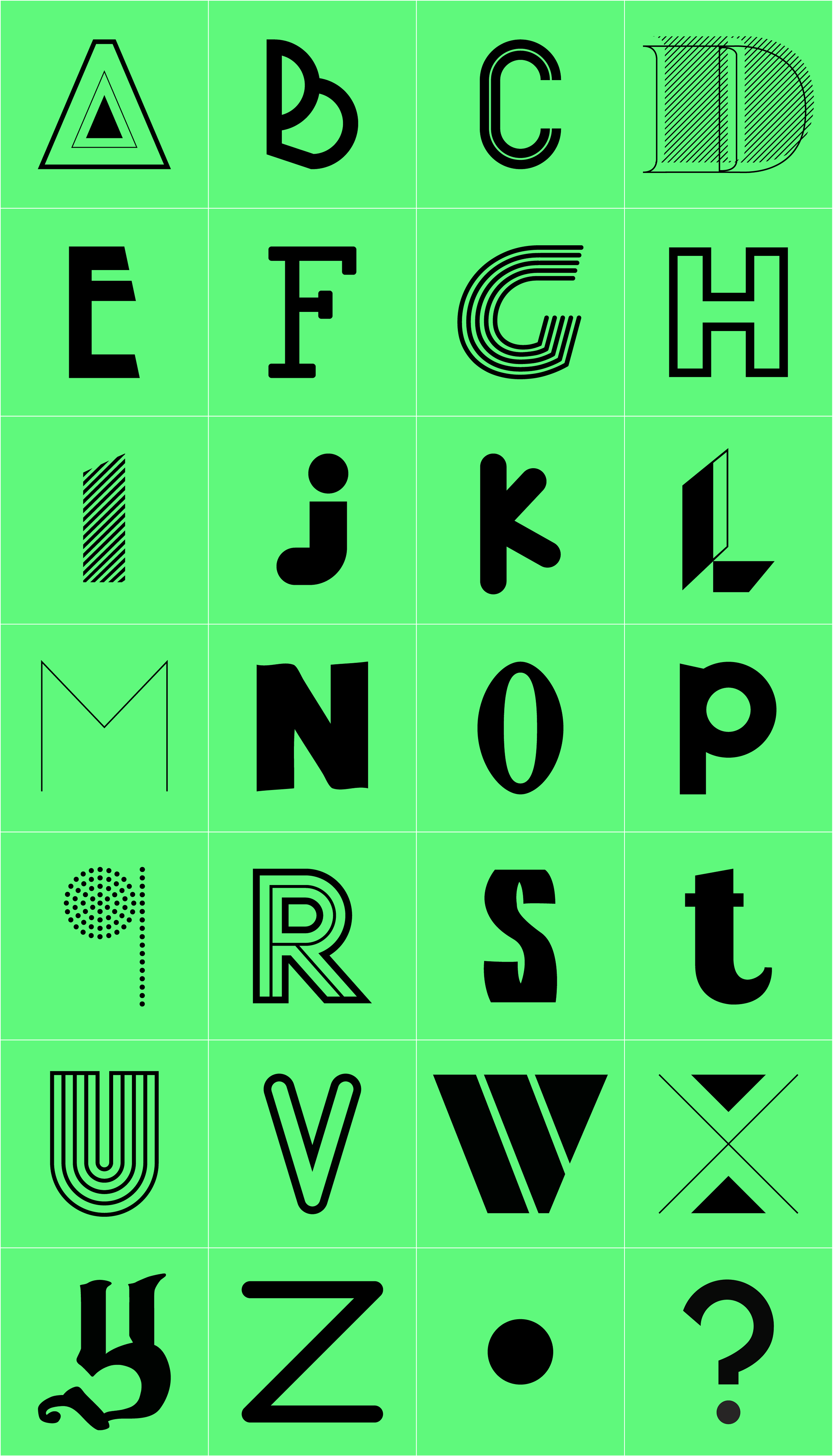
Upon browsing folders of design work for various brand identity projects I compiled this motley letter collection, none of which made the final cut and were left to lie in the archives as unfinished logotypes and letter-sets. Some personal favourites are the ‘k’ ‘s’ and ‘t’ for their rather unconventional styles.
What is your favourite letter? Answers on a beermat to info@wildilk.com / @wildilk - if enough of you like it we might even arrange a limited edition print run in celebration!